
The Power of Color: Creating Calm Spaces in Your Home
6/20/20268 min read


Understanding the Psychology of Color
The psychology of color delves into how different hues can influence human emotions and behaviors. Each color carries unique associations that can evoke specific feelings, making the choice of colors in our living spaces a decisive factor in establishing an atmosphere conducive to well-being. For instance, soft shades of blue are often linked with tranquility and calmness, making them ideal for relaxation areas such as bedrooms or reading nooks. Similarly, greens, reminiscent of nature, can enhance feelings of peace and balance, providing a soothing backdrop that fosters serenity.
On the other hand, warmer tones such as reds and oranges can energize a space, which may not be suitable for areas designated for relaxation. While these brighter colors can stimulate conversations and creativity, they may also lead to feelings of restlessness if overused in personal spaces. Therefore, understanding the psychological effects of color can significantly aid in creating environments that promote not only aesthetic appeal but also emotional well-being.
Moreover, individual preferences and cultural backgrounds can affect how one perceives colors. For instance, while some may find yellow invigorating and cheerful, others might view it as overwhelming. Thus, it is important to consider personal associations with colors when designing spaces. Incorporating subtle tones or combining complementary shades can create a harmonious environment that nurtures calmness, helping to achieve the desired serene atmosphere. By thoughtfully selecting colors according to their psychological impacts, one can craft living spaces that not only look inviting but also resonate with a sense of tranquility and comfort.
Choosing a cohesive color palette is essential for creating a harmonious and calming atmosphere in your home. The colors you select can greatly influence the mood and ambiance of your spaces. To begin the process of selecting your palette, it's vital to identify the emotional response you wish to evoke. Are you aiming for a serene sanctuary, or a vibrant living area? Your intended use for each room can guide your color choices.
Start by limiting your palette to 3-5 colors. This restriction will not only simplify your decision-making but also help achieve visual cohesion throughout your home. Begin with a base color that will dominate the space, which can be complemented by one or two accent colors to add depth and interest. For instance, soft blues and greens can evoke a sense of tranquility, making them ideal for bedrooms and bathrooms, while warmer tones like terracotta or muted yellows can make living spaces feel inviting.
In addition to choosing your main colors, consider utilizing varying shades or tints of these colors to add complexity without overwhelming the eye. Incorporating neutrals, such as whites, beiges, or grays, allows for flexibility and can act as a serene backdrop, making the selected tones pop. It's also important to consider the natural light in the room; colors can appear differently depending on lighting conditions, so testing swatches in various times of the day can be beneficial.
Lastly, don’t shy away from personalizing your color palette. Artwork, textiles, and decorative elements can serve as inspiration for your colors. By finding colors that resonate with your personal style, you can curate an environment that is uniquely yours while promoting calmness and clarity.
Using Neutrals for a Soothing Backdrop
Neutral colors play a pivotal role in establishing a calming environment within the home. These shades, including whites, beiges, greys, and soft browns, create a versatile backdrop that encourages relaxation and tranquility. By employing neutrals in your decor, you provide a base that can harmoniously integrate with bolder accent colors or textures while maintaining a sense of peace in your living space.
To effectively incorporate neutral shades into your home, consider starting with the walls. Soft, muted tones can transform a room into a serene sanctuary. Light beige or soft grey, for example, can amplify natural light, making a space feel airy and open. Alternatively, a fresh white can provide a crisp, clean backdrop that enhances other design elements.
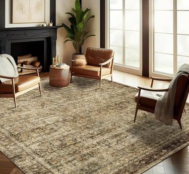
In addition to wall colors, furniture and decor items in neutral shades can elevate your interior design. A cozy beige sofa or taupe armchair serves as a central piece, allowing surrounding decor—such as vibrant cushions or artwork—to shine without overwhelming the senses. Layering textures and materials can further enhance the calming effect: think of beautifully woven baskets, soft cotton throws, or natural wood accents, which can enrich the overall aesthetic without disrupting the tranquil ambiance.
Moreover, neutral colors can be particularly effective in spaces designed for relaxation, such as bedrooms or sitting areas. Utilizing these soothing shades creates a seamless flow throughout the home. The strategic application of neutrals can enable you to use varying hues to signify different moods without causing visual chaos, ensuring your living spaces remain inviting and restful.
In conclusion, neutral colors are an essential component in crafting a calming environment within your home. By thoughtfully integrating these tones into your decor, you cultivate an atmosphere that nurtures serenity and encourages a peaceful lifestyle.
Adding Depth with Accents and Textures
Creating a calm space is an essential aspect of interior design, where color and texture play pivotal roles. In a primarily monochromatic color scheme, introducing accent colors can provide visual interest without disrupting the tranquility of the overall aesthetics. Thoughtfully selected accent colors can either harmonize with the main color palette or provide a subtle contrast that draws the eye without causing disruption.
For instance, incorporating muted shades of blue or soft earth tones can enhance a serene environment, while deeper hues, such as navy or forest green, can add depth and sophistication when used sparingly. These pops of color can be applied through various elements such as cushions, artworks, or decorative vases. The key is to limit the use of these accent colors to a few strategically placed items in a room, ensuring they remain a complement to the existing palette rather than overpowering it.
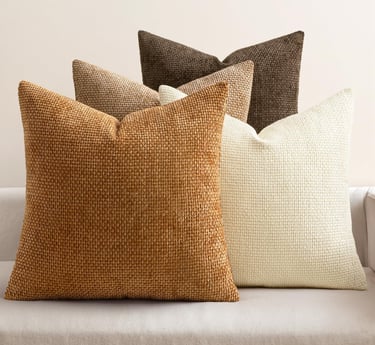
In addition to color, the use of textures significantly contributes to the calm ambiance of a space. Varying materials can create a tactile interest that engages the senses. Soft textiles like velvet or wool can add warmth and a cozy feel, while smooth surfaces such as glass and ceramic can provide a sense of tranquility and cleanliness. Layering textures, such as pairing a plush blanket with a sleek metal lamp, can create a balanced and inviting atmosphere.
Furthermore, integrating natural textures like wood or stone can foster a connection with the outdoors, which is often associated with a peaceful environment. The objective is to blend different elements harmoniously, as the interplay of various textures not only enhances the visual appeal but also contributes to an overall calming experience in the space. By carefully planning the introduction of accent colors and textures, one can successfully elevate a serene home ambiance into a space that feels both aesthetically pleasing and deeply calming.
Creating Focal Points with Color
Utilizing color effectively in interior design can significantly enhance the overall aesthetic and emotional resonance of a room. When creating focal points, it is important to choose colors that not only stand out but also harmonize with the surrounding elements. A focal point can be a piece of furniture, artwork, or an architectural feature that you want to draw attention to. Selecting the right color to highlight these areas will provide visual interest and help to create a balanced atmosphere.
Bright, bold colors often serve as excellent statement pieces, acting as an anchor within a space. For instance, a deep teal accent wall can serve as a striking backdrop for a neutral-colored sofa, creating a stunning visual contrast. Additionally, vibrant hues like fiery reds or sunny yellows can energize a room, making them ideal for areas intended for social interaction, like living rooms or dining areas. When using these colors, it can be beneficial to limit their usage to a single accent or piece to prevent overwhelming the space.
Conversely, when aiming for tranquility and calmness, softer colors such as pastels or muted tones are more effective. Shades of pale blue, gentle greens, or soft grays can instill a sense of serenity, perfect for bedrooms or relaxing spaces. These calming colors should be used in larger areas to create a cohesive, soothing effect throughout the room. Incorporating natural light will also enhance these hues, allowing them to take on a warm, inviting glow.
In summary, when creating focal points in your home, carefully consider the colors you choose. Bold tones can create dynamic and engaging uplift, while softer shades promote relaxation. Balancing these elements will lead to well-designed, inviting spaces that resonate with their intended purpose.
Maintaining Color Harmony Across Different Spaces
Creating a calm environment within the home requires a careful approach to color selection, particularly in maintaining harmony across different spaces. This harmony ensures that adjacent rooms feel connected while still allowing each area to have its unique character. One effective strategy is to establish a guiding color palette that serves as a foundation for your choices throughout the home. This palette can consist of a range of colors, including complementary shades that tie various rooms together.
When selecting a color scheme, consider utilizing a dominant color, paired with accent and neutral hues. The dominant color can be used in its various forms across different rooms, while accents can be introduced through furnishings or decorative elements. For example, a soft blue wall in the living room can be complemented by aqua throw pillows in the adjacent dining area, providing a visual link without overwhelming the spaces with identical colors. The continuity of color serves to create a sense of flow, making transitions from room to room feel seamless.
Another useful technique is to incorporate textures and patterns within your color scheme. Different patterns can add individuality to each room, while still adhering to the overarching color theme. For instance, a geometric pattern in the hallway can utilize the same colors as floral prints in the bedrooms, maintaining a cohesive aesthetic. Moreover, paying attention to the finish of the paint can alter the perception of the color and how it interacts with lighting, impacting the way each room feels.
Finally, remember that maintaining color harmony does not mean every room must look identical; rather, it should evoke a unified essence throughout the home. By thoughtfully integrating colors, textures, and patterns, homeowners can create the desired calming effect that enhances each unique space, while collectively reflecting a harmonious living environment.
Real-Life Examples and Inspirations
When it comes to designing a calming environment within the home, real-life examples can serve as powerful inspirations. Many individuals and interior designers have embraced the principles of using a limited color palette, showcasing its effectiveness in creating serene spaces. One such example can be found in minimalist homes, where the predominant use of soft neutrals coupled with natural materials fosters an atmosphere of tranquility. For instance, a living room painted in muted greys and soft beiges, accented with wooden elements, creates a harmonious balance that invites relaxation.
Another striking example is found in bedrooms that utilize calming shades of blue or green. These colors are often associated with nature and the outdoors, effectively promoting a sense of peace and calm. A simple bedroom design featuring pale aqua walls, complemented by soft white linens, illustrates an ideal retreat from the chaos of everyday life. The choice of color not only contributes to the soothing ambience but also encourages better sleep patterns, making it a practical application of color psychology in home decor.
Moreover, incorporating calming colors in kitchen spaces can drastically alter the mood of this often-busy area. For instance, a kitchen with light mint green cabinetry paired with creamy countertops creates a refreshing feel, while wooden accents add warmth. This combination showcases how color can transform a functional space into one that feels inviting and peaceful.
These examples underscore that a limited color palette, thoughtfully chosen, can yield stunning results. By leveraging the power of color, individuals can successfully create calming environments that resonate with serenity, fostering a sense of well-being in their homes. As readers consider refreshing their own spaces, these inspirations offer a clear path to achieving that vision through the effective use of color.


Subscribe Now to Receive Your Free Household Management Planner
Customer Care
Contactus@OsunaHomeTrends.com
Osuna Home Trends is a branch of The Osuna Project LLC
*Affiliate Links receive a small commission to help keep our site running
Contact Us
FAQ